
Luton Town
Football Club
A Rebrand Case Study

What is not working in with the current logo in 2026?
-
Too much visual complexity: modern football branding must work at tiny digital sizes (apps, broadcast graphics, social avatars). At small scale, the inside of this crest collapses into visual noise.
-
Typography lacks authority: top clubs now own bespoke typography or at least distinctive letterforms.
-
The badge only works in one format is not versatile for other applications (monomarks, Kits-only versions, Simplified broadcast marks, Digital animations)
-
Inconsistent visual language: currently, the badge looks like historical layers stacked across decades
The Approach
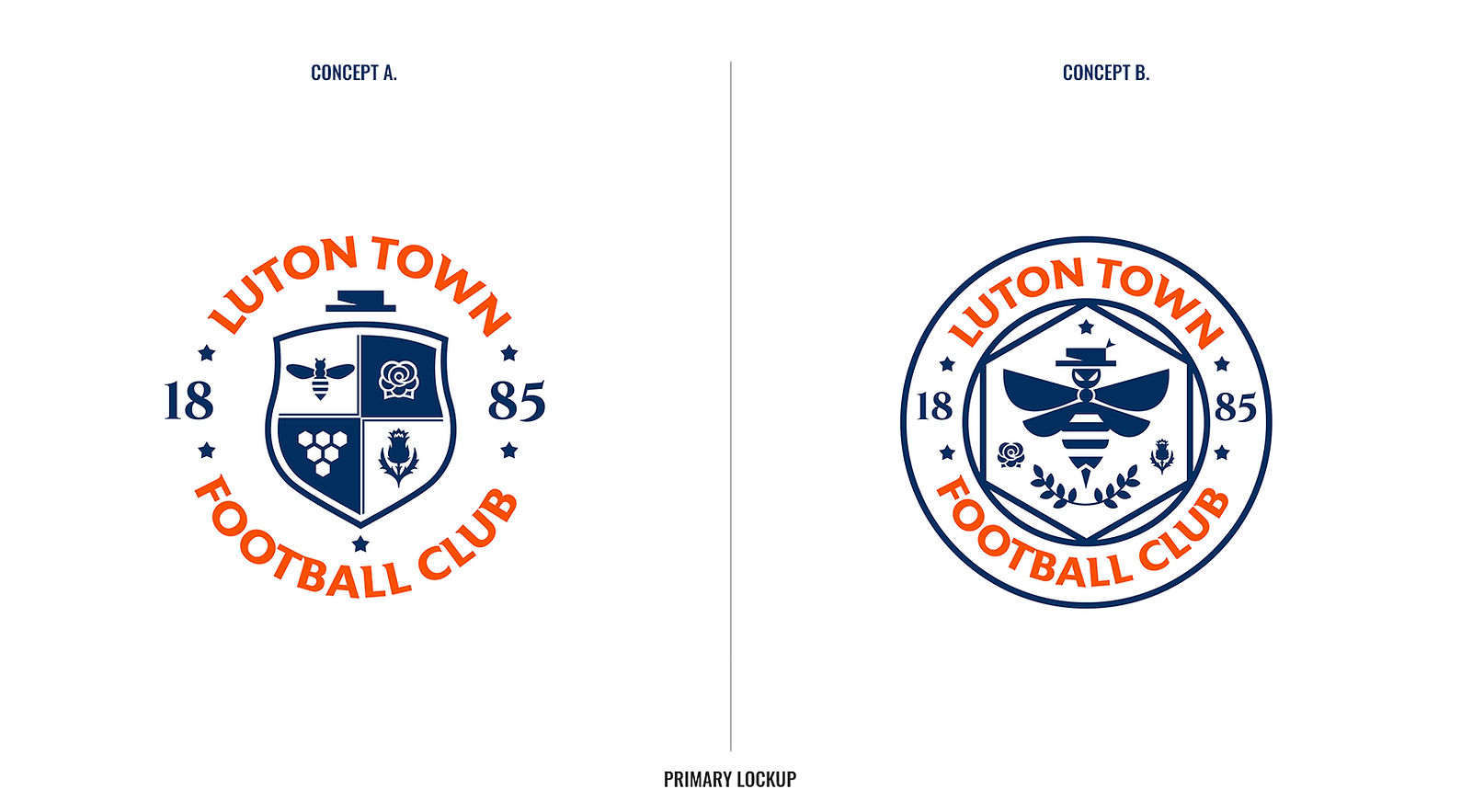
Concept A.
This one keeps the same familiar shield shape, so it still feels like "the Luton badge" at a glance. But inside, it's been tidied up. Same symbols, just cleaner and in one consistent style instead of looking like they were added at different times. It's an easier badge to recognise quickly, especially at a small size, without losing any of the history.
Concept B.
This one takes it a step further. Instead of the hat and the bee being two separate small pictures, they're combined into a single character, a bee wearing the hat. That gives the club one strong, distinctive symbol instead of several small ones, and it's something no other football club has. It also sits inside a circular badge shape, which feels a bit more like an official stamp or seal. It's a bigger change from what fans are used to, but it's more memorable and more ownable as a piece of branding.


